 The middle class American worker is in danger of becoming an endangered species. The politicians are not telling you the truth, and the mainstream media is certainly not telling you the truth, but the reality is that there is nothing but bad news on the horizon for workers in the United States. In the old days, when the big corporations that dominate our society did well, that also meant good things for American workers since those corporations would need more of us to work for them. But in the emerging one world economic system that our economy is being merged into, those corporations have other choices now. For instance, the big corporations can now choose to limit the number of “expensive” American workers that they employ by shipping millions of jobs to the other side of the world. And from their perspective, it makes perfect sense. They can make much bigger profits by hiring people on the other side of the planet to work for them for less than a dollar an hour. If they can get good production out of those people, then why should they hire Americans for ten to twenty times as much, plus have to give those Americans health insurance and other benefits? Another major factor in the slow, agonizing death of the American worker is technology. We live during a period when technology is advancing at a pace that is almost unimaginable at the same time that it is steadily becoming cheaper and cheaper. That means that it is going to become easier and easier for companies to replace workers with robots and computers. As I have written about previously, it is being projected that our economy will lose millions of jobs to technology in the coming years. Yes, some of us will still be needed to help build the robots and the computers, but not all of us will. And of course the overall general weakness of the economy is not helping matters either. The American people inherited the greatest economic machine in the history of the world, and we have wrecked it. Decades of very foolish decisions have resulted in the period of steady economic decline that we are experiencing now.
America is simply not the economic powerhouse that it once was. Back in 2001, the U.S. economy accounted for 31.8 percent of global GDP. By 2011, the U.S. economy only accounted for 21.6 percent of global GDP. That is a collapse any way that you want to look at it.
Today, American workers are living in an economy that is rapidly declining, and their jobs are steadily being stolen by robots, computers and foreign workers that live in countries where it is legal to pay slave labor wages. Politicians from both political parties refuse to do anything to stop the bleeding because they think that the status quo is working just great.
So don’t expect things to get better any time soon.
The following are 10 amazing charts that demonstrate the slow, agonizing death of the American worker…
#1 Wages And Salaries As A Percentage Of GDP
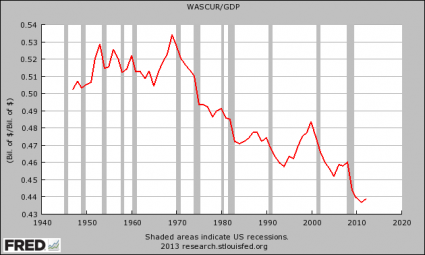
As you can see, wages as a percentage of GDP are hovering near an all-time record low. That means that American workers are bringing home a smaller share of the economic pie than ever before.
#2 Average Annual Hours Worked Per Employed Person In The United States
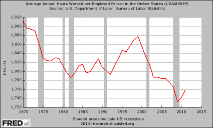
We are an economy that is rapidly trading good paying full-time jobs for low paying part-time jobs. The decline in average annual hours worked that we have witnessed represents the equivalent of losing millions of jobs. There has been an explosion of “the working poor” in the United States, and this trend is probably only going to accelerate in the years to come.
#3 Manufacturing Employment
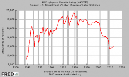
As you can see, there are less Americans working in manufacturing today than there was in 1950 even though the population of the country has more than doubled since then. The United States has lost more than 56,000 manufacturing facilities since 2001, and yet our politicians stand around and do nothing about it.
#4 Employment-Population Ratio
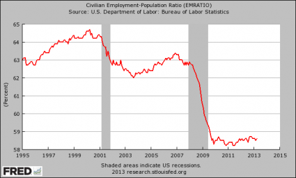
This is one of my favorite charts. It shows that there has been absolutely no employment recovery at all since the end of the last recession. The percentage of working age Americans that have a job has stayed under 59 percent for 44 months in a row. How much worse will things get when the next major economic downturn strikes?
#5 Labor Force Participation Rate
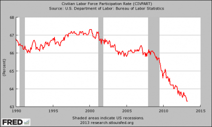
This is how the Obama administration is getting the “unemployment rate” to magically go down. They are pretending that millions upon millions of Americans simply do not want to work anymore. As you will notice, the decline of the labor force participation rate has accelerated greatly since Barack Obama entered the White House.
#6 Duration Of Unemployment
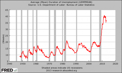
The average amount of time that it takes an unemployed worker to find a new job has declined slightly, but it is still far above normal historical levels. It is a crying shame that it takes the average unemployed worker two-thirds of a year to find a new job, but this is the new economic reality that we are all living in.
#7 Delinquency Rate On Residential Mortgages

Since there are not enough jobs for all of us, and since our wages are not rising as rapidly as the cost of living is, a whole bunch of us are falling behind on our mortgages. As you can see, the mortgage delinquency rate has only dropped slightly and is still way, way above typical levels.
#8 New Homes Sold
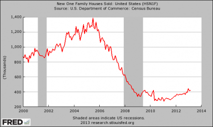
American workers also don’t have enough money to go out and buy new homes either. Yes, new home sales have rebounded slightly this year, but we are nowhere near where we used to be.
#9 Consumer Credit
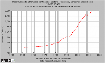
Millions of American families continue to resort to going into debt in a desperate attempt to make ends meet. After a slight interruption during the last recession, consumer credit once again is growing at a frightening pace.
#10 Self-Employment At A Record Low
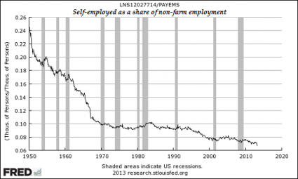
Since there aren’t enough jobs for everyone, why aren’t more Americans trying to start their own businesses? Well, the reality of the matter is that the government has made it exceedingly difficult to start your own business today. Taxes, rules, regulations and red tape are choking the life out of millions of small businesses in the United States. As a result, the percentage of self-employed Americans is at a record low.
As all of these long-term trends continue, the middle class will continue to shrink, poverty in America will continue to explode and government dependence will continue to rise.
The numbers don’t lie. Today, the number of Americans on Social Security Disability now exceeds the entire population of Greece, and the number of Americans on food stamps now exceeds the entire population of Spain.
We are in the midst of a horrifying economic collapse, and the next major wave of that collapse is rapidly approaching.
Are you ready?