If Anyone Doubts That We Are In A Stock Market Bubble, Show Them This Article

Bubble In Hands - Public Domain
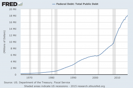
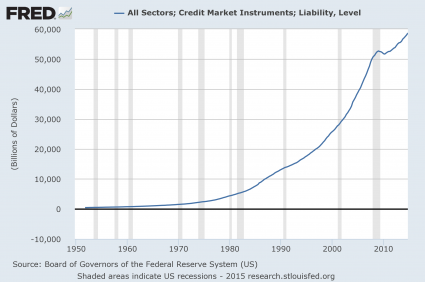
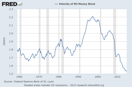
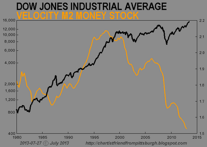
The higher financial markets rise, the harder they fall.  By any objective measurement, the stock market is currently well into bubble territory.  Anyone should be able to see this – all you have to do is look at the charts.  Sadly, most of us never seem to learn from history.  Most of us want to believe that somehow “things are different this time”.  Well, about the only thing that is different this time is that our economy is in far worse shape than it was just prior to the last major financial crisis.  That means that we are more vulnerable and will almost certainly endure even more damage this time around.  It would be one thing if stocks were soaring because the U.S. economy as a whole was doing extremely well.  But we all know that isn’t true.  Instead, what we have been experiencing is clearly artificial market behavior that has nothing to do with economic reality.  In other words, we are dealing with an irrational financial bubble, and all irrational financial bubbles eventually burst.  And as I wrote about yesterday, the way that stocks have moved so far this year is eerily reminiscent of the way that stocks moved in early 2008.  The warning signs are there – if you are willing to look at them.

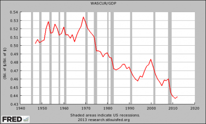
The first chart that I want to share with you today comes from Doug Short.  It is a chart that shows that the ratio of corporate equities (stocks) to GDP is the second highest that it has been since 1950.  The only other time it has been higher was just before the dotcom bubble burst…

The Buffett Indicator from Doug Short

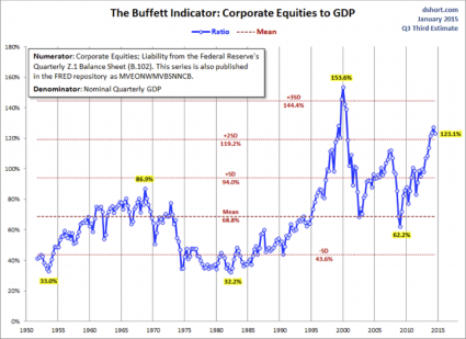
Does that look like a bubble to you?

It sure looks like a bubble to me.

In order for the corporate equities to GDP ratio to get back to the mean (average) level, stock prices would have to fall nearly 50 percent.

If that happens, people will be calling it a crash, but in truth it would just be a return to normalcy.

This next chart comes from Phoenix Capital Research.  The CAPE ratio (cyclically adjusted price-to-earnings ratio) is considered to be an extremely accurate measure of the true value of stocks…

As I’ve noted before, the single best predictor of stock market performance is the cyclically adjusted price-to-earnings ratio or CAPE ratio.

Corporate earnings are heavily influenced by the business cycle. Typically the US experiences a boom and bust once every ten years or so. As such, companies will naturally have higher P/E’s at some points and lower P/E’s at other. This is based solely on the business cycle and nothing else.

CAPE adjusts for this by measuring the price of stocks against the average of ten years’ worth of earnings, adjusted for inflation. By doing this, it presents you with a clearer, more objective picture of a company’s ability to produce cash in any economic environment.

Based on a study completed Vanguard, CAPE was the single best metric for measuring future stock returns.

When the CAPE ratio is too high, that means that stocks are overpriced and are not a good value.  And right now the CAPE ratio is the 3rd highest that it has been since 1890.  That only times it has been higher than this were in 1929 (we all remember what happened then) and just before the dotcom bubble burst…

CAPE - Phoenix Capital Research

The funny thing is that stocks have continued to rise even as corporate revenues have begun to fall.

According to Wolf Richter, in the first quarter of 2015 corporate revenues are projected to decline at the fastest pace that we have seen since the depths of the last recession…

Week after week, corporations and analysts have been whittling down their estimates. By now, revenues of the S&P 500 companies are expected to decline 2.8% in Q1 from a year ago – the worst year-over-year decline since Q3 of crisis year 2009.

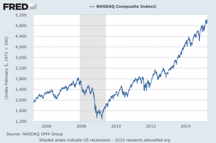
This next chart I want to share with you shows how the Nasdaq has performed over the past decade.  Looking at this chart alone, you would think that the U.S. economy must have been absolutely roaring since the end of the last recession.  But what is really going on is rampant speculation.  Some of the tech companies that make up the Nasdaq are not making any profits at all and yet they are supposedly worth billions of dollars.  If you cannot see a bubble in this chart, you need to get your vision checked…

NASDAQ Chart

And this kind of irrational euphoria is not just happening in the United States.

For example, Chinese stocks are up nearly 80 percent over the past nine months.

Meanwhile, the overall Chinese economy is growing at the slowest pace that we have seen in about 20 years.

Right now, we are in the calm before the storm.  We are right at the door of the next great financial crisis, and most of the people that work in the industry know this.

And once in a while they let the cat out of the bag.

For example, consider what Hans-Jörg Vetter, the CEO of Landesbank Baden-Württemberg in Germany, had to say during one recent press conference

“Risk is no longer priced in,” he said. And these investors aren’t paid for the risks they’re taking. This applies to all asset classes, he said. The stock and the bond markets, he said, are now both seeing “the mother of all bubbles.”

This can’t go on forever. Or for very long. But he couldn’t see the future either and pin down a date, which is what everyone wants to know so that they can all get out in time. “I cannot tell you when it will rumble,” he said, “but eventually it will rumble again.”

By “again” he meant the sort of thing that had taken the bank down last time, the Financial Crisis. It had been triggered by horrendous risk-taking, where risks hadn’t been priced into all kinds of securities. When those securities – mortgage-backed securities, for example, that were hiding the inherent risks under a triple-A rating – blew up, banks toppled.

What Vetter is telling us is what I have been warning about for a long time.

Another great stock market crash is coming.

It is just a matter of time.

10 Charts Which Show We Are Much Worse Off Than Just Before The Last Economic Crisis

10 Charts Economic CrisisIf you believe that ignorance is bliss, you might not want to read this article.  I am going to dispel the notion that there has been any sort of “economic recovery”, and I am going to show that we are much worse off than we were just prior to the last economic crisis.  If you go back to 2007, people were feeling really good about things.  Houses were being flipped like crazy, the stock market was booming and unemployment was relatively low.  But then the financial crisis of 2008 struck, and for a while it felt like the world was coming to an end.  Of course it didn’t come to an end – it was just the first wave of our problems.  The waves that come next are going to be the ones that really wipe us out.  Unfortunately, because we have experienced a few years of relative stability, many Americans have become convinced that Barack Obama, Janet Yellen and the rest of the folks in Washington D.C. have fixed whatever problems caused the last crisis.  Even though all of the numbers are screaming otherwise, there are millions upon millions of people out there that truly believe that everything is going to be okay somehow.  We never seem to learn from the past, and when this next economic downturn strikes it is going to do an astonishing amount of damage because we are already in a significantly weakened state from the last one.

For each of the charts that I am about to share with you, I want you to focus on the last shaded gray bar on each chart which represents the last recession.  As you will see, our economic problems are significantly worse than they were just before the financial crisis of 2008.  That means that we are far less equipped to handle a major economic crisis than we were the last time.

#1 The National Debt

Just prior to the last recession, the U.S. national debt was a bit above 9 trillion dollars.  Since that time, it has nearly doubled.  So does that make us better off or worse off?  The answer, of course, is obvious.  And even though Barack Obama promises that “deficits are under control”, more than a trillion dollars was added to the national debt in fiscal year 2014.  What we are doing to future generations by burdening them with so much debt is beyond criminal.  And so what does Barack Obama want to do now?  He wants to ramp up government spending and increase the debt even faster.  This is something that I covered in my previous article entitled “Barack Obama Says That What America Really Needs Is Lots More Debt“.

Presentation National Debt

#2 Total Debt

Over the past 40 years, the total amount of debt in the United States has skyrocketed to astronomical heights.  We have become a “buy now, pay later” society with devastating consequences.  Back in 1975, our total debt level was sitting at about 2.5 trillion dollars.  Just prior to the last recession, it was sitting at about 50 trillion dollars, and today we are rapidly closing in on 60 trillion dollars.

Presentation Credit Market Instruments

#3 The Velocity Of Money

When an economy is healthy, money tends to change hands and circulate through the system quite rapidly.  So it makes sense that the velocity of money fell dramatically during the last recession.  But why has it kept going down since then?

Presentation Velocity Of M2

#4 The Homeownership Rate

Were you aware that the rate of homeownership in the United States has fallen to a 20 year low?  Traditionally, owning a home has been a sign that you belong to the middle class.  And the last recession was really rough on the middle class, so it makes sense that the rate of homeownership declined during that time frame.  But why has it continued to steadily decline ever since?

Presentation Homeownership Rate

#5 The Employment Rate

Barack Obama loves to tell us how the unemployment rate is “going down”.  But as I will explain later in this article, this decline is primarily based on accounting tricks.  Posted below is a chart of the civilian employment-population ratio.  Just prior to the last recession, approximately 63 percent of the working age population of the United States was employed.  During the recession, this ratio fell to below 59 percent and it stayed there for several years.  Just recently it has peeked back above 59 percent, but we are still very, very far from where we used to be, and now the next economic downturn is rapidly approaching.

Presentation Employment Population Ratio

#6 The Labor Force Participation Rate

So how can Obama get away with saying that the unemployment rate has gone down dramatically?  Well, each month the government takes thousands upon thousands of long-term unemployed workers and decides that they have been unemployed for so long that they no longer qualify as “part of the labor force”.  As a result, the “labor force participation rate” has fallen substantially since the end of the last recession…

Presentation Labor Force Participation Rate

#7 The Inactivity Rate For Men In Their Prime Working Years

If things are “getting better”, then why are so many men in their prime working years doing nothing at all?  Just prior to the last recession, the inactivity rate for men in their prime working years was about 9 percent.  Today it is just about 12 percent.

Presentation Inactivity Rate

#8 Real Median Household Income

Not only is a smaller percentage of Americans employed today than compared to just prior to the last recession, the quality of our jobs has gone down as well.  This is one of the factors which has resulted in a stunning decline of real median household income.

Presentation Real Median Household Income

I have shared these next numbers before, but they bear repeating.  In America today, most Americans do not make enough to support a middle class lifestyle on a single salary.  The following figures come directly from the Social Security Administration

-39 percent of American workers make less than $20,000 a year.

-52 percent of American workers make less than $30,000 a year.

-63 percent of American workers make less than $40,000 a year.

-72 percent of American workers make less than $50,000 a year.

We all know people that are working part-time jobs because that is all that they can find in this economy.  As the quality of our jobs continues to deteriorate, the numbers above are going to become even more dismal.

#9 Inflation

Even as our incomes have stagnated, the cost of living just continues to rise steadily.  For example, the cost of food and beverages has gone up nearly 50 percent just since the year 2000.

Presentation Food Inflation

#10 Government Dependence

As the middle class shrinks and the number of Americans that cannot independently take care of themselves soars, dependence on the government is reaching unprecedented heights.  For instance, the federal government is now spending about twice as much on food stamps as it was just prior to the last recession.  How in the world can anyone dare to call this an “economic recovery”?

Presentation Government Spending On Food Stamps

So you tell me – are things “getting better” or are they getting worse?

To me, it is crystal clear that we are in much worse condition than we were just prior to the last economic crisis.

And now things are setting up in textbook fashion for the next great economic crisis.  Unfortunately, most Americans are totally clueless about what is going on and the vast majority are completely and totally unprepared for what is coming.

Or could it be possible that I am wrong?  Whether you agree or disagree with me, please feel free to add to the discussion by posting a comment below…

7 Charts That Prove That The Stock Market Has Become Completely Divorced From Reality

7The mainstream media would have us believe that the U.S. economy must be in great shape since the stock market has been setting new all-time record highs this month.  But is that really true?  Yes, surging stock prices have enabled sales of beach homes in the Hamptons to hit a brand new record high.  However, the reality is that stock prices have not risen dramatically in recent years because corporations are doing so much better than before.  In fact, the growth in stock prices has been far, far greater than the growth of corporate revenues.  The only reason that stock prices have been climbing so much is because the Federal Reserve has been flooding the financial system with hundreds of billions of dollars that it has created out of thin air.  The Fed has created an artificial stock market bubble that is completely and totally divorced from economic reality.

Meanwhile, everything is not so fine for the rest of the U.S. economy.  Economic growth projections have been steadily declining over the past two years, and the growth rate of personal income in the United States has been on a huge downward trend since 2008.  The U.S. economy actually lost 240,000 full-time jobs last month, and the middle class continues to shrink.

So welcome to the “new normal” where most Americans struggle at least part of the time.  According to one recent survey, “four out of 5 U.S. adults struggle with joblessness, near poverty or reliance on welfare for at least parts of their lives”.  Things are tough out there, and they are steadily getting tougher.

Yes, the boys and girls up on Wall Street are doing great (for the moment), but most of the rest of the country is really struggling.  We have never even come close to recovering from the last major economic crisis, and now another one is rapidly approaching.

The other day, Chartist Friend from Pittsburgh sent me an email and told me that he had some charts that he wanted to share with me and asked if I wanted to see them.  I said sure, send them over right away.  These charts show very clearly that the stock market has become completely divorced from reality.

In a normal market, stock prices would only rise dramatically if the overall economy was healthy and growing.  Unfortunately, our economy is far from healthy and has been declining for a very long time.  If the financial markets were not being pumped up by so much money printing and so much debt, there is no way that stock prices would be this high.

If we truly did have a free market financial system, stock prices should be a reflection of the overall economy.  Instead, we have a very sick economy and financial markets that have been very highly manipulated.

For example, just check out the first chart that I have posted below.  If the economy was actually getting better, the percentage of working age Americans with a job should be increasing.  Sadly, that is not happening…

CFPGH-DJIA-04

This next chart shows how the average duration of unemployment has absolutely skyrocketed in recent years.  Yes, the duration of unemployment has improved slightly in recent months, but we are still very far from where we used to be.  Meanwhile, the stock market has been soaring to new all-time record highs…

CFPGH-DJIA-11

Traditionally, there has been a high degree of correlation between stock prices and real disposable personal income.  From the chart below, you can see that this relationship held up quite well through the end of the last recession, and then it started breaking down.  This is especially true at the very end of the chart.  Real Disposable income has started to decline sharply but stock prices just continue to soar…

CFPGH-DJIA-19

When an economy is healthy, money tends to circulate through that economy at a healthy pace.  That is why the chart below is so alarming.  The velocity of money is the lowest that it has been in modern times, and this indicates that economic activity should be slowing down.  But the Federal Reserve has enabled the bankers to thrive by pumping massive amounts of money into the financial system…

CFPGH-DJIA-05

When an economy goes into recession, freight shipments tend to go down.  In the chart below, you can see that this happened during the past two recessions.  Unfortunately, we have never even come close to returning to the level that we were at before the last recession, and yet the stock market has been able to soar to unprecedented heights…

CFPGH-DJIA-17

When an economy is growing and people are able to get good jobs, they tend to go out and buy new homes.  Yes, we have seen a bit of an increase in the number of new homes sold recently, but we are still a vast distance away from the level we were at before the last recession.  And now mortgage rates are starting to rise steadily, and this is likely going to cause the number of new homes sold to start going back down.  The chart below clearly shows us that the real estate market is far from healthy at this point…

CFPGH-DJIA-09

For most middle class Americans, their homes are their primary financial assets.  So the fact that home prices have declined so much is absolutely devastating for many families.  But stocks are primarily held by the top 5 percent of all Americans, and as the chart below shows, they have benefited greatly from the antics of the Federal Reserve in recent years…

CFPGH-DJIA-08

There is no way in the world that the stock market should be this high.  The economic fundamentals simply do not justify it.  As a society, we consume far more than we produce, our debt is growing at an exponential pace, our economic infrastructure is being absolutely gutted and our financial system is a giant Ponzi scheme that could collapse at any time.

And no market can stay divorced from reality forever.  At some point this bubble is going to burst, and when financial bubbles burst they tend to do so very rapidly.

As Marc Faber recently said, “one day, this financial bubble will have to adjust on the downside.”

When it does “adjust”, we are likely going to see a financial panic even worse than we witnessed back in 2008.  Credit will freeze up, economic activity will grind to a standstill and millions of Americans will lose their jobs.

Don’t assume that the bubble of false prosperity that we are enjoying right now will last forever.

It won’t.

Use the time that you have right now to prepare for what is ahead.

A great storm is rapidly approaching, and I don’t see any way that it is going to be averted.

10 Amazing Charts That Demonstrate The Slow, Agonizing Death Of The American Worker

10 Amazing Charts That Demonstrate The Slow, Agonizing Death Of The American WorkerThe middle class American worker is in danger of becoming an endangered species.  The politicians are not telling you the truth, and the mainstream media is certainly not telling you the truth, but the reality is that there is nothing but bad news on the horizon for workers in the United States.  In the old days, when the big corporations that dominate our society did well, that also meant good things for American workers since those corporations would need more of us to work for them.  But in the emerging one world economic system that our economy is being merged into, those corporations have other choices now.  For instance, the big corporations can now choose to limit the number of “expensive” American workers that they employ by shipping millions of jobs to the other side of the world.  And from their perspective, it makes perfect sense.  They can make much bigger profits by hiring people on the other side of the planet to work for them for less than a dollar an hour.  If they can get good production out of those people, then why should they hire Americans for ten to twenty times as much, plus have to give those Americans health insurance and other benefits?  Another major factor in the slow, agonizing death of the American worker is technology.  We live during a period when technology is advancing at a pace that is almost unimaginable at the same time that it is steadily becoming cheaper and cheaper.  That means that it is going to become easier and easier for companies to replace workers with robots and computers.  As I have written about previously, it is being projected that our economy will lose millions of jobs to technology in the coming years.  Yes, some of us will still be needed to help build the robots and the computers, but not all of us will.  And of course the overall general weakness of the economy is not helping matters either.  The American people inherited the greatest economic machine in the history of the world, and we have wrecked it.  Decades of very foolish decisions have resulted in the period of steady economic decline that we are experiencing now.

America is simply not the economic powerhouse that it once was.  Back in 2001, the U.S. economy accounted for 31.8 percent of global GDP.  By 2011, the U.S. economy only accounted for 21.6 percent of global GDP.  That is a collapse any way that you want to look at it.

Today, American workers are living in an economy that is rapidly declining, and their jobs are steadily being stolen by robots, computers and foreign workers that live in countries where it is legal to pay slave labor wages.  Politicians from both political parties refuse to do anything to stop the bleeding because they think that the status quo is working just great.

So don’t expect things to get better any time soon.

The following are 10 amazing charts that demonstrate the slow, agonizing death of the American worker…

#1 Wages And Salaries As A Percentage Of GDP

Wages And Salaries As A Percentage Of GDP

As you can see, wages as a percentage of GDP are hovering near an all-time record low.  That means that American workers are bringing home a smaller share of the economic pie than ever before.

#2 Average Annual Hours Worked Per Employed Person In The United States

Average Annual Hours Worked per Employed Person in the United States

We are an economy that is rapidly trading good paying full-time jobs for low paying part-time jobs.  The decline in average annual hours worked that we have witnessed represents the equivalent of losing millions of jobs.  There has been an explosion of “the working poor” in the United States, and this trend is probably only going to accelerate in the years to come.

#3 Manufacturing Employment

Manufacturing Employment

As you can see, there are less Americans working in manufacturing today than there was in 1950 even though the population of the country has more than doubled since then.  The United States has lost more than 56,000 manufacturing facilities since 2001, and yet our politicians stand around and do nothing about it.

#4 Employment-Population Ratio

Employment-Population Ratio 2013

This is one of my favorite charts.  It shows that there has been absolutely no employment recovery at all since the end of the last recession.  The percentage of working age Americans that have a job has stayed under 59 percent for 44 months in a row.  How much worse will things get when the next major economic downturn strikes?

#5 Labor Force Participation Rate

Labor Force Participation Rate

This is how the Obama administration is getting the “unemployment rate” to magically go down.  They are pretending that millions upon millions of Americans simply do not want to work anymore.  As you will notice, the decline of the labor force participation rate has accelerated greatly since Barack Obama entered the White House.

#6 Duration Of Unemployment

Duration Of Unemployment

The average amount of time that it takes an unemployed worker to find a new job has declined slightly, but it is still far above normal historical levels.  It is a crying shame that it takes the average unemployed worker two-thirds of a year to find a new job, but this is the new economic reality that we are all living in.

#7 Delinquency Rate On Residential Mortgages

Delinquency Rate On Residential Mortgages

Since there are not enough jobs for all of us, and since our wages are not rising as rapidly as the cost of living is, a whole bunch of us are falling behind on our mortgages.  As you can see, the mortgage delinquency rate has only dropped slightly and is still way, way above typical levels.

#8 New Homes Sold

New Homes Sold

American workers also don’t have enough money to go out and buy new homes either.  Yes, new home sales have rebounded slightly this year, but we are nowhere near where we used to be.

#9 Consumer Credit

Consumer Credit

Millions of American families continue to resort to going into debt in a desperate attempt to make ends meet.  After a slight interruption during the last recession, consumer credit once again is growing at a frightening pace.

#10 Self-Employment At A Record Low

Self-Employed As A Share Of Non-Farm Employment

Since there aren’t enough jobs for everyone, why aren’t more Americans trying to start their own businesses?  Well, the reality of the matter is that the government has made it exceedingly difficult to start your own business today.  Taxes, rules, regulations and red tape are choking the life out of millions of small businesses in the United States.  As a result, the percentage of self-employed Americans is at a record low.

As all of these long-term trends continue, the middle class will continue to shrink, poverty in America will continue to explode and government dependence will continue to rise.

The numbers don’t lie.  Today, the number of Americans on Social Security Disability now exceeds the entire population of Greece, and the number of Americans on food stamps now exceeds the entire population of Spain.

We are in the midst of a horrifying economic collapse, and the next major wave of that collapse is rapidly approaching.

Are you ready?