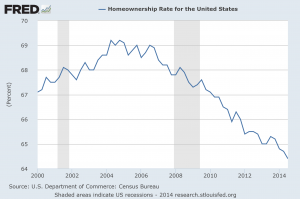
 We just learned that the homeownership rate in the United States has fallen to the lowest level in 19 years. But of course this is not a new trend. As you will see in this article, the homeownership rate in the United States has been in a continual decline for more than 7 years. Obviously this is not a sign of a healthy economy. Traditionally, homeownership has been one of the key indicators that you belong to the middle class. When people define “the American Dream”, it is usually one of the first things mentioned. So if the percentage of Americans that own a home has been steadily going down for 7 years in a row, what does that tell us about the health of the middle class in this country?
The chart that you are about to view is clear evidence that we are in the midst of a long-term economic decline. It shows what has happened to the homeownership rate in the U.S. since the year 2000, and as you can see it has been collapsing since the peak of the housing market back in 2007. Does this look like a housing recovery to you?…
So many people get caught up in what is happening on Wall Street, but this is the “real economy” that affects people on a day to day basis.
Most Americans just want to be able to buy a home and provide a solid middle class living for their families.
The fact that the percentage of people that are able to achieve this “American Dream” is falling rapidly is very troubling.
There are some that blame this stunning decline in the homeownership rate on the Millennials.
And without a doubt, they are a significant part of the story. They are moving back home with their parents at record rates, and many that are striking out on their own are renting apartments in the big cities.
This is one area where the decline of marriage in America is really hitting the economy. Back in 1968, well over 50 percent of Americans in the 18 to 31-year-old age bracket were already married and living on their own. Today, that number is below 25 percent.
But that is not all there is to this story.
In fact, the homeownership rate for Americans in the 35 to 44-year-old age bracket has been falling even faster than it has for Millennials…
In the first quarter of 2008, nearly 67% of people aged 35-44 owned homes. Now the number is barely above 59%. The percentage of people under 35 owning homes only fell five percentage points, to 36% from 41%.
So why is this happening?
Well, it is fairly simple actually.
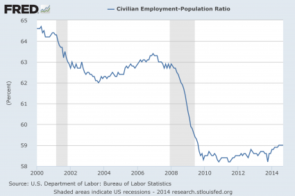
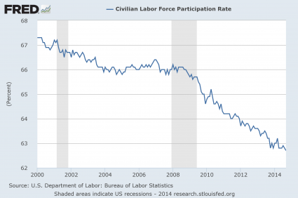
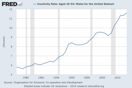
In order to buy homes, people need to have good jobs. And at this point, the percentage of Americans that are employed is still about where it was during the depths of the last recession.
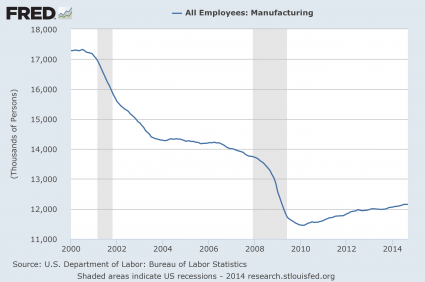
In addition, wages in the United States have stagnated and the quality of our jobs continues to go down. As I wrote about the other day, half of all American workers make less than $28,031 a year. Needless to say, if you make less than $28,031 a year, you are going to have a really hard time getting approved for a home loan or making mortgage payments.
Things have been changing for a long time in this country, and not for the better. Our economic problems have taken decades to develop, and the underlying causes of these problems is still not being addressed.
Meanwhile, middle class families continue to suffer. One very surprising new survey discovered that more than half of all Americans now consider themselves to be “lower-middle class or working class with low economic security”. While Wall Street has been celebrating in recent years, economic pessimism has become deeply ingrained on Main Street…
Optimism may be harder to come by these days. More than half of Americans surveyed in a Harris poll released Tuesday identified themselves as being lower-middle class or working class with low economic security. And 75 percent said they’re being held back financially by roadblocks like the cost of housing (24 percent), health care (21 percent) and credit-card debt (20 percent).
And that’s not the kicker.
“The most disappointing aspect is that 45 percent think they’ll never get their finances back to where they were before the financial crisis,” said Ken Rees, CEO of the Elevate credit service company, which commissioned the survey. “And a third are losing sleep over it.”
The only “recovery” that we have experienced since the last recession has been a temporary recovery on Wall Street.
For the rest of the country, our long-term economic decline has continued.
When I was growing up, my father was serving in the U.S. Navy and we lived in a fairly typical middle class neighborhood. Everyone that I went to school with lived in a nice home and I never heard of any parent struggling to find work. Of course life was not perfect, but it seemed to me like living a middle class lifestyle was “normal” for most people.
How times have changed since then.
Today, it seems like we are all part of a giant reality show where people are constantly being removed from the middle class and everyone is wondering who will be next.
So what do you think?
Is there hope for the middle class, or are the economic problems that we are facing just beginning?
Please feel free to share your opinion by posting a comment below…


