12 Charts That Show The Permanent Damage That Has Been Done To The U.S. Economy

12 - Public DomainMost people that discuss the “economic collapse” focus on what is coming in the future.  And without a doubt, we are on the verge of some incredibly hard times.  But what often gets neglected is the immense permanent damage that has been done to the U.S. economy by the long-term economic collapse that we are already experiencing.  In this article I am going to share with you 12 economic charts that show that we are in much, much worse shape than we were five or ten years ago.  The long-term problems that are eating away at the foundations of our economy like cancer have not been fixed.  In fact, many of them continue to get even worse year after year.  But because unprecedented levels of government debt and reckless money printing by the Federal Reserve have bought us a very short window of relative stability, most Americans don’t seem too concerned about our long-term problems.  They seem to have faith that our “leaders” will be able to find a way to muddle through whatever challenges are ahead.  Hopefully this article will be a wake up call.  The last major wave of the economic collapse did a colossal amount of damage to our economic foundations, and now the next major wave of the economic collapse is rapidly approaching.
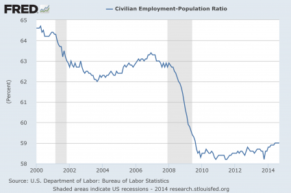
#1 Employment

The mainstream media is constantly telling us about the “employment recovery” that is happening in the United States, but the truth is that it is just an illusion.  As the chart below demonstrates, just prior to the last recession about 63 percent of all working age Americans had a job.  During the last wave of the economic collapse, that number dropped to below 59 percent and stayed there for a very long time.  In the past few months we have finally seen the employment-population ratio tick back up to 59 percent, but we are still far, far below where we used to be.  To call the tiny little bump at the end of this chart a “recovery” is really an insult to our intelligence…

Employment Population Ratio 2014

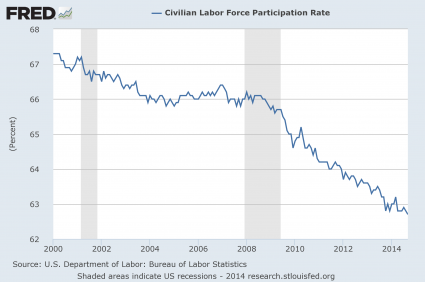
#2 The Labor Force Participation Rate

The percentage of Americans that are either employed or currently looking for a job started to fall during the last recession and it has not stopped falling since then.  The labor force participation rate has now fallen to a 36 year low, and this is a sign of a very, very sick economy…

Labor Force Participation Rate 2014

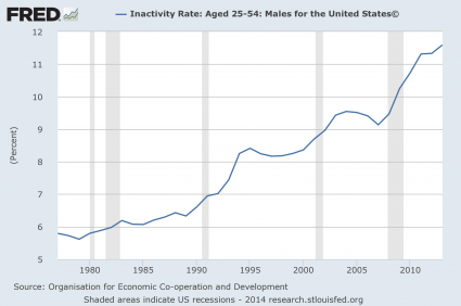
#3 The Inactivity Rate For Men In Their Prime Years

Some blame the decline in the labor force participation rate on the aging of our population.  But it isn’t just elderly people that are dropping out of the labor force.  In fact, the inactivity rate for men in their prime working years (25 to 54) continues to rise and is now at the highest level that has ever been recorded…

Inactivity Rate Men 2014

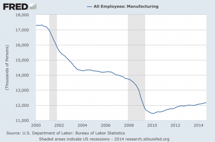
#4 Manufacturing Employees

Once upon a time in America, anyone that was reliable and willing to work hard could easily find a manufacturing job somewhere.  But we have stood by and allowed millions upon millions of good paying manufacturing jobs to be shipped out of the country, and now many of our formerly great manufacturing cities have been transformed into ghost towns.  Over the past few years, there has been a slight “recovery”, but we are still well below where we were at just previous to the last recession…

Manufacturing Employees 2014

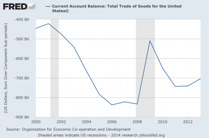
#5 Our Current Account Balance

As a nation, we buy far more from the rest of the world than they buy from us.  In other words, we perpetually consume far more wealth than we produce.  This is a recipe for national economic suicide.  Our current account balance soared to obscene levels just prior to the last recession, and now we have almost gotten back to those levels…

Current Account Balance 2014

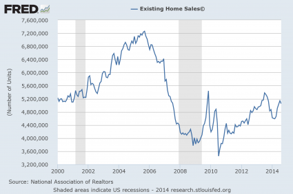
#6 Existing Home Sales

Our economy has never fully recovered from the housing crash of 2007-2008.  As you can see from the chart below, the number of existing home sales is still far below the level that we hit back in 2006.  At this point we are just getting back to the level we were at in 2000, but our population today is far larger than it was back then…
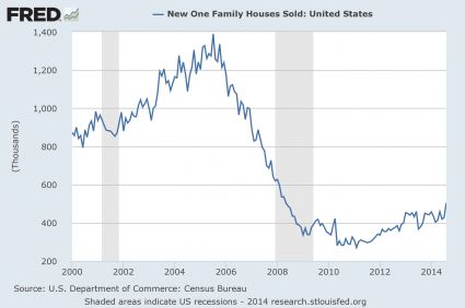
Existing Home Sales 2014

#7 New Home Sales

Things are even more dramatic when you look at new home sales.  This is an industry that have been absolutely emasculated.  The number of new home sales in the United States is just a little more than half of what it was back in 2000, and it isn’t even worth comparing to what we experienced during the peak of 2006.

New Home Sales 2014

#8 The Monetary Base

In a desperate attempt to get the economy going again, the Federal Reserve has been wildly printing money.  It has been so reckless that it is hard to put it into words.  When I look at this chart, the phrase “Weimar Republic” comes to mind…
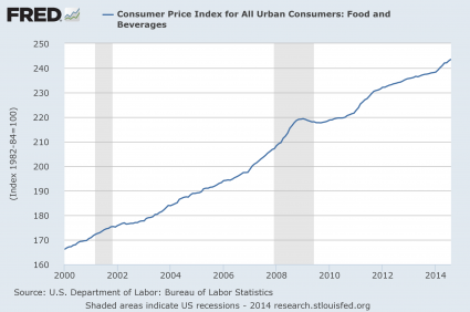
Monetary Base 2014

#9 Food Inflation

Thankfully, much of the money that the Federal Reserve has been injecting into the system has not made it into the real economy.  But enough of it has gotten into the system to force food prices significantly higher.  For example, my wife went to the store today and paid just a shade under 10 bucks for just four pieces of chicken.  And as you can see from the chart below, food prices have been steadily going up in America for a very long time…

Food Inflation 2014

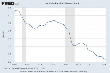
#10 The Velocity Of Money

One of the reasons why we have not seen even more inflation is because the velocity of money is extraordinarily low.  In general, when an economy is healthy money tends to flow through the system rapidly.  People are buying and selling and money changes hands frequently.  But when an economy is sick, money tends to stagnate.  And that is exactly what is happening in the United States right now.  In fact, at this point the velocity of the M2 money stock has dropped to the lowest level ever recorded…

Velocity Of Money 2014

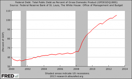
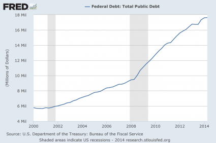
#11 The National Debt

As our economic fundamentals have deteriorated, our politicians have attempted to prop up our standard of living by borrowing from the future.  The U.S. national debt is on pace to approximately double during the Obama years, and it increased by more than a trillion dollars in fiscal year 2014 alone.  Despite assurances that “the deficit is under control”, the federal government borrows about a trillion dollars a year to fund new spending in addition to borrowing about 7 trillion dollars to pay off old debt that is coming due.  What we are doing to future generations of Americans is absolutely criminal, and it is just a matter of time before this Ponzi scheme totally collapses…
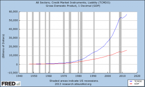
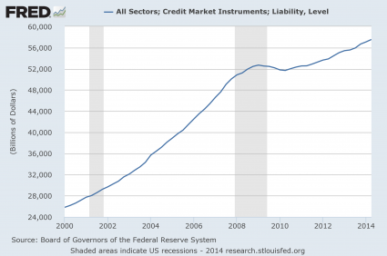
National Debt 2014

#12 Total Debt

Of course it is not just the federal government that is gorging on debt.  When you add up all forms of debt in our society (government, business, consumer, etc.) it comes to a grand total of more than 57 trillion dollars.  This total has more than doubled since the year 2000…

Total Debt 2014

If you know anyone that believes that we are in good economic shape, just show them these charts.

The numbers do not lie.  Our economy is sick and it is getting sicker by the day.

And of course the next major financial crisis could strike at any time.  U.S. stocks just experienced their worst week in three years, and if cases of Ebola start popping up around the country the fear that would cause could collapse our economy all by itself.

The debt-fueled prosperity that we are enjoying today is not real.  We are living on the fumes of our past, and every single day our long-term problems get even worse.

Anyone with half a brain should be able to see what is coming.

Sadly, most Americans will continue to deny the truth until it is far too late.

Share This Chart With Anyone That Believes The U.S. Economy Is Not Going To Crash

Total Debt Growth vs. GDP GrowthAnyone that thinks that the U.S. economy can keep going along like this is absolutely crazy.  We are in the terminal phase of an unprecedented debt spiral which has allowed us to live far, far beyond our means for the last several decades.  Unfortunately, all debt spirals eventually end, and they usually do so in a very disorderly manner.  The chart that you are about to see is one of my favorite economic charts.  It compares the growth of U.S. GDP to the growth of total debt in the United States.  Yes, U.S. GDP has certainly grown at a decent pace over the years, but our total debt has absolutely exploded.  40 years ago, the total amount of debt in our system (government debt + corporate debt + consumer debt, etc.) was about 2 trillion dollars.  Today it has grown to more than 56 trillion dollars.  Our debt has grown at a much, much faster rate than our economy has, and there is no way in the world that we will be able to continue to do that for long.

Posted below is the chart that I was talking about.  The blue line is our total debt, and the red line is our GDP.  As you can see, this chart kind of speaks for itself…

Total Debt Growth vs. GDP Growth

So how did we get here?

Well, of course the federal government has been the biggest offender.  It would be a tremendous understatement to say that the politicians in Washington D.C. have been reckless.  Since the year 2000, the size of the U.S. national debt has grown by more than 11 trillion dollars.

Posted below is a chart that demonstrates the dramatic growth of the national debt as a percentage of GDP.  In particular, our debt has absolutely exploded as a percentage of GDP since the financial crisis of 2008…

National Debt As A Percentage Of GDP

Does that look sustainable to you?

Of course it isn’t.

Right now, the mainstream media is very excited that the federal budget deficit for this year might be less than a trillion dollars, but they are really missing the point.  The debt of the U.S. government is still growing much, much faster than the economy is, and the United States already has more government debt per capita than Greece, Portugal, Italy, Ireland or Spain.

What we are doing to future generations is absolutely criminal.  We are piling up mountains of debt that will haunt them for the rest of their lives just so that we can make the present a little bit more pleasant for ourselves.

As I noted in another article, during Obama’s first term the federal government accumulated more debt than it did under the first 42 U.S presidents combined.  And now we are entering a time period when demographic forces are going to put a tremendous amount of pressure on the finances of the federal government.

The Baby Boomers have started to retire, and they are going to want to start collecting on all of the financial promises that we have made to them.

As I have written about previously, the number of Americans on Medicare is projected to grow from a little bit more than 50 million today to 73.2 million in 2025.

The number of Americans collecting Social Security benefits is projected to grow from about 56 million today to 91 million in 2035.

Where are we going to get the money to pay for all of that?

Boston University economist Laurence Kotlikoff has calculated that the U.S. government is facing unfunded liabilities of 222 trillion dollars in the years ahead.

There is no simply no way that the U.S. government is going to be able to meet those obligations without wildly printing up money.

And of course the federal government is not the only one with massive debt problems.  We just saw the city of Detroit go bankrupt, and there are lots of other communities all over the nation that could soon follow.

Posted below is a chart that shows the growth of state and local government debt over the years.  In particular, please take note that the total amount of state and local government debt has grown from about 1.2 trillion dollars in the year 2000 to about 3 trillion dollars today…

State And Local Government Debt

But the chart posted above does not even take into account the massive unfunded pension obligations that state and local governments are facing.  According to the Detroit Free Press, state governments are facing unfunded pension obligations of nearly a trillion and a half dollars…

From Baltimore to Los Angeles, and many points in between, municipalities are increasingly confronted with how to pay for these massive promises. The Pew Center for the States, in Washington, estimated states’ public pension plans across the U.S. were underfunded by a whopping $1.4 trillion in 2010.

And many large cities are dealing with similar situations.  Detroit was the first to go down, but could Chicago or Los Angeles eventually be forced to declare bankruptcy too?…

Chicago recently saw its credit rating downgraded because of a $19-billion unfunded pension liability that the ratings service Moody’s puts closer to $36 billion. And Los Angeles could be facing a liability of more than $30 billion, by some estimates.

According to a report that was released earlier this year, the largest U.S. cities are facing hundreds of billions of dollars in unfunded pension liabilities at this point…

Early this year, the Pew Center released a survey showing that 61 of the nation’s largest cities — limiting the survey to the largest city in each state and all other cities with more than 500,000 people — had a gap of more than $217 billion in unfunded pension and health care liabilities. While cities had long promised health care, life insurance and other benefits to retirees, “few … started saving to cover the long-term costs,” the report said.

So where will all of that money come from?

That is a good question, and nobody has an easy answer at this point.

Meanwhile, U.S. consumers have been racking up staggering amounts of debt over the past several decades.  Just consider the following numbers…

-Total home mortgage debt in the United States is now about 5 times larger than it was just 20 years ago.

-Car loans just keep getting longer and longer, and approximately 70 percent of all car purchases in the United States now involve an auto loan.

-The total amount of student loan debt in America recently surpassed the one trillion dollar mark.

-One study discovered that approximately 41 percent of all working age Americans either have medical bill problems or are currently paying off medical debt, and according to a report published in The American Journal of Medicine medical bills are a major factor in more than 60 percent of the personal bankruptcies in the United States.

-Consumer debt in the United States has risen by a whopping 1700% since 1971, and 46% of all Americans carry a credit card balance from month to month.

Sadly, most people don’t realize how damaging credit card debt can be.  If you just carry an “average balance” on your credit cards each month, and those credit cards have just an “average” interest rate, you could end up paying millions of dollars to the credit card companies by the end of your life…

Let’s say you are an average American household, and you carry an average balance of $15,956 in credit card debt.

Also, as an average American household, let’s assume you pay an average current rate of 12.83%.

Finally, let’s assume you carry this average balance for 40 years, between ages 25 and 65.  How much did your credit card company make off of you and your extreme averageness?

Answer: $2,629,618.64

Incredibly, a large percentage of the population does not seem to understand these things.  An astounding 43 percent of all American families spend more than they earn each year.

Are you starting to understand why approximately half of all Americans die broke?

We are a nation that is completely and addicted to debt.

If you do not believe that it will ever catch up with us you are being delusional.

We have piled up the biggest mountain of debt in the history of the planet, and a day of reckoning is fast approaching.

One Economic Chart That You Should Permanently Burn Into Your Memory

Today most Americans are completely obsessed with the silliest of things.  They wonder how Lindsay Lohan is going to fare in jail and they agonize over who LeBron James is going to play basketball for.  But when it comes to the things that really matter, most Americans are completely clueless.  For example, while most Americans would agree that we are experiencing difficult economic times right now, most of them would also argue that our economic system is in fundamentally good shape and that things will get back to “normal” at some point.  Those of us who are trying to warn America of the impending economic nightmare are dismissed as “doom and gloomers” and “conspiracy theorists”.  But of course, as with so many things, the passage of time will tell who was right and who was wrong.  Below there is a chart that I want all of you to burn into your memory.  It is a chart of total U.S. debt as a percentage of GDP from 1870 until 2009.  This chart clearly and succinctly communicates the horror of the debt bubble that we are currently dealing with.  When this debt bubble pops, it is going to make the Great Depression look like a Sunday picnic.

As you can see from the chart below, the total of all debt (government, business and consumer) is now somewhere in the neighborhood of 360 percent of GDP.  Never before has the United States faced a debt bubble of this magnitude…. 

Most of us were not alive during the Great Depression, but those who were remember how incredibly painful it was for America to deleverage and bring the economic system back into some type of balance.

So if our current debt bubble is far worse, what kind of economic horror is ahead for us?

But the truth is that we are facing some circumstances that even the folks back during the Great Depression did not have to deal with….

1 – Back in the 1930s, tens of millions of Americans lived on farms or knew how to grow their own food.  Today the vast majority of Americans are totally dependent on the system for even their most basic needs.

2 – A vast horde of Baby Boomers is expecting to retire, and the “Social Security trust fund” has nothing but 2.5 trillion dollars of government IOUs in it.  According to an official U.S. government report, rapidly growing interest costs on the U.S. national debt together with spending on major entitlement programs such as Social Security and Medicare will absorb approximately 92 cents of every dollar of federal revenue by the year 2019.  This is a financial tsunami the likes of which Americans back in the 1930s could never have even dreamed of.

3 – American workers never had to compete for jobs with workers on the other side of the world back in the 1930s.  But today, millions upon millions of our jobs have been “outsourced” to China, India and a vast array of third world nations where desperate workers are more than happy to slave away for big global corporations for less than a dollar an hour.  How in the world are American workers supposed to compete with that?

4 – Back in the 1930s, there was nothing like the gigantic derivatives bubble that hangs over us today.  The total value of all derivatives worldwide is estimated to be somewhere between 600 trillion and 1.5 quadrillion dollars.  The danger that we face from derivatives is so great that Warren Buffet has called them “financial weapons of mass destruction”.  When this bubble pops there won’t be enough money in the entire world to fix it.

5 – During the Great Depression, the United States economy was relatively self-contained.  But today we truly do live in a global economy.  Unfortunately that means that a severe economic crisis in one part of the world is going to affect us as well.  Right now, the United States is far from alone in dealing with a massive debt crisis.  Greece, Spain, Italy, Hungary, Portugal and a number of other European nations are in real danger of actually defaulting on their debts.  Japan (the third biggest economy in the world) is on the verge of complete and total economic collapse.  So what happens to the U.S. economy when the dominoes start to fall? 

The truth is that by almost any measure, we are in worse economic condition than we were right before the beginning of the Great Depression.  We have been living way beyond our means and the debts we have been piling up are clearly not anywhere close to sustainable. 

Did you think that we could just continue to run deficits equal to 10 percent of GDP forever?

Of course not.

The U.S. economy is being driven off a cliff, but America’s “ruling class” has insisted all along that they know better than we do

But the truth is that in the final analysis it is not us that they care about.

What they do actually care about is getting more money and more power for themselves and for other members of the ruling class.  Today, 10,000 people make 30% of the total income in the United States each year.

That leaves 70% of the pie for the remaining 99.99% of us to divide up.

The reality is that however you want to slice it, the U.S. economic system is broken.  However, considering the fact that America’s ruling class has a stranglehold on both major political parties, we are not likely to see any fundamental changes any time soon.

That is very unfortunate, because time is running out on the U.S. economy.