The Six Too Big To Fail Banks In The U.S. Have 278 TRILLION Dollars Of Exposure To Derivatives

Bankers - Public Domain
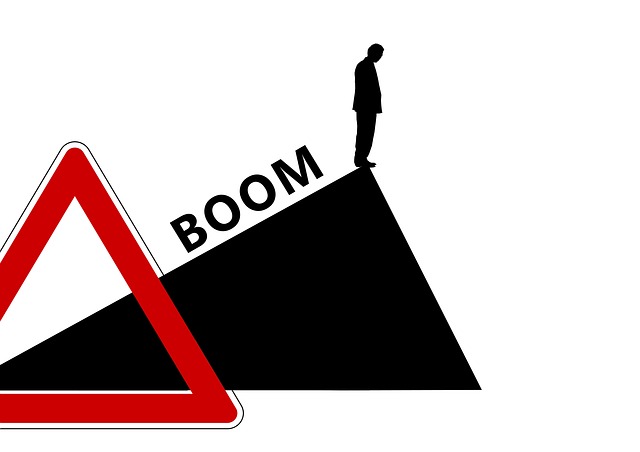
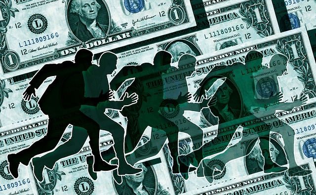
The very same people that caused the last economic crisis have created a 278 TRILLION dollar derivatives time bomb that could go off at any moment.  When this absolutely colossal bubble does implode, we are going to be faced with the worst economic crash in the history of the United States.  During the last financial crisis, our politicians promised us that they would make sure that “too big to fail” would never be a problem again.  Instead, as you will see below, those banks have actually gotten far larger since then.  So now we really can’t afford for them to fail.  The six banks that I am talking about are JPMorgan Chase, Citibank, Goldman Sachs, Bank of America, Morgan Stanley and Wells Fargo.  When you add up all of their exposure to derivatives, it comes to a grand total of more than 278 trillion dollars.  But when you add up all of the assets of all six banks combined, it only comes to a grand total of about 9.8 trillion dollars.  In other words, these “too big to fail” banks have exposure to derivatives that is more than 28 times greater than their total assets.  This is complete and utter insanity, and yet nobody seems too alarmed about it.  For the moment, those banks are still making lots of money and funding the campaigns of our most prominent politicians.  Right now there is no incentive for them to stop their incredibly reckless gambling so they are just going to keep on doing it.

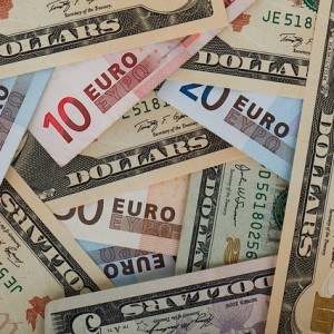
So precisely what are “derivatives”?  Well, they can be immensely complicated, but I like to simplify things.  On a very basic level, a “derivative” is not an investment in anything.  When you buy a stock, you are purchasing an ownership interest in a company.  When you buy a bond, you are purchasing the debt of a company.  But a derivative is quite different.  In essence, most derivatives are simply bets about what will or will not happen in the future.  The big banks have transformed Wall Street into the biggest casino in the history of the planet, and when things are running smoothly they usually make a whole lot of money.

But there is a fundamental flaw in the system, and I described this in a previous article

The big banks use very sophisticated algorithms that are supposed to help them be on the winning side of these bets the vast majority of the time, but these algorithms are not perfect.  The reason these algorithms are not perfect is because they are based on assumptions, and those assumptions come from people.  They might be really smart people, but they are still just people.

Today, the “too big to fail” banks are being even more reckless than they were just prior to the financial crash of 2008.

As long as they keep winning, everyone is going to be okay.  But when the time comes that their bets start going against them, it is going to be a nightmare for all of us.  Our entire economic system is based on the flow of credit, and those banks are at the very heart of that system.

In fact, the five largest banks account for approximately 42 percent of all loans in the United States, and the six largest banks account for approximately 67 percent of all assets in our financial system.

So that is why they are called “too big to fail”.  We simply cannot afford for them to go out of business.

As I mentioned above, our politicians promised that something would be done about this.  But instead, the four largest banks in the country have gotten nearly 40 percent larger since the last time around.  The following numbers come from an article in the Los Angeles Times

Just before the financial crisis hit, Wells Fargo & Co. had $609 billion in assets. Now it has $1.4 trillion. Bank of America Corp. had $1.7 trillion in assets. That’s up to $2.1 trillion.

And the assets of JPMorgan Chase & Co., the nation’s biggest bank, have ballooned to $2.4 trillion from $1.8 trillion.

During this same time period, 1,400 smaller banks have completely disappeared from the banking industry.

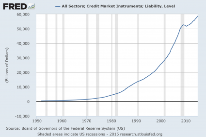
So our economic system is now more dependent on the “too big to fail” banks than ever.

To illustrate how reckless the “too big to fail” banks have become, I want to share with you some brand new numbers which come directly from the OCC’s most recent quarterly report (see Table 2)

JPMorgan Chase

Total Assets: $2,573,126,000,000 (about 2.6 trillion dollars)

Total Exposure To Derivatives: $63,600,246,000,000 (more than 63 trillion dollars)

Citibank

Total Assets: $1,842,530,000,000 (more than 1.8 trillion dollars)

Total Exposure To Derivatives: $59,951,603,000,000 (more than 59 trillion dollars)

Goldman Sachs

Total Assets: $856,301,000,000 (less than a trillion dollars)

Total Exposure To Derivatives: $57,312,558,000,000 (more than 57 trillion dollars)

Bank Of America

Total Assets: $2,106,796,000,000 (a little bit more than 2.1 trillion dollars)

Total Exposure To Derivatives: $54,224,084,000,000 (more than 54 trillion dollars)

Morgan Stanley

Total Assets: $801,382,000,000 (less than a trillion dollars)

Total Exposure To Derivatives: $38,546,879,000,000 (more than 38 trillion dollars)

Wells Fargo

Total Assets: $1,687,155,000,000 (about 1.7 trillion dollars)

Total Exposure To Derivatives: $5,302,422,000,000 (more than 5 trillion dollars)

Compared to the rest of them, Wells Fargo looks extremely prudent and rational.

But of course that is not true at all.  Wells Fargo is being very reckless, but the others are being so reckless that it makes everyone else pale in comparison.

And these banks are not exactly in good shape for the next financial crisis that is rapidly approaching.  The following is an excerpt from a recent Business Insider article

The New York Times isn’t so sure about the results from the Federal Reserve’s latest round of stress tests.

In an editorial published over the weekend, The Times cites data from Thomas Hoenig, vice chairman of the FDIC, who, in contrast to the Federal Reserve, found that capital ratios at the eight largest banks in the US averaged 4.97% at the end of 2014, far lower than the 12.9% found by the Fed’s stress test.

That doesn’t sound good.

So what is up with the discrepancy in the numbers?  The New York Times explains…

The discrepancy is due mainly to differing views of the risk posed by the banks’ vast holdings of derivative contracts used for hedging and speculation. The Fed, in keeping with American accounting rules and central bank accords, assumes that gains and losses on derivatives generally net out. As a result, most derivatives do not show up as assets on banks’ balance sheets, an omission that bolsters the ratio of capital to assets.

Mr. Hoenig uses stricter international accounting rules to value the derivatives. Those rules do not assume that gains and losses reliably net out. As a result, large derivative holdings are shown as assets on the balance sheet, an addition that reduces the ratio of capital to assets to the low levels reported in Mr. Hoenig’s analysis.

Derivatives, eh?

Very interesting.

And you know what?

The guys running these big banks can see what is coming.

Just consider the words that JPMorgan Chase chairman and CEO Jamie Dimon wrote to his shareholders not too long ago

Some things never change — there will be another crisis, and its impact will be felt by the financial market.

The trigger to the next crisis will not be the same as the trigger to the last one – but there will be another crisis. Triggering events could be geopolitical (the 1973 Middle East crisis), a recession where the Fed rapidly increases interest rates (the 1980-1982 recession), a commodities price collapse (oil in the late 1980s), the commercial real estate crisis (in the early 1990s), the Asian crisis (in 1997), so-called “bubbles” (the 2000 Internet bubble and the 2008 mortgage/housing bubble), etc. While the past crises had different roots (you could spend a lot of time arguing the degree to which geopolitical, economic or purely financial factors caused each crisis), they generally had a strong effect across the financial markets

In the same letter, Dimon mentioned “derivatives moved by enormous players and rapid computerized trades” as part of the reason why our system is so vulnerable to another crisis.

If this is what he truly believes, why is his firm being so incredibly reckless?

Perhaps someone should ask him that.

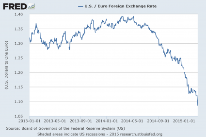
Interestingly, Dimon also discussed the possibility of a Greek exit from the eurozone

“We must be prepared for a potential exit,”  J. P. Morgan Chief Executive Officer Jamie Dimon said. in his annual letter to shareholders. “We continually stress test our company for possible repercussions resulting from such an event.”

This is something that I have been warning about for a long time.

And of course Dimon is not the only prominent banker warning of big problems ahead.  German banking giant Deutsche Bank is also sounding the alarm

With a U.S. profit recession expected in the first half of 2015 and investors unlikely to pay up for stocks, the risk of a stock market drop of 5% to 10% is rising, Deutsche  Bank says.

That’s the warning Deutsche Bank market strategist David Bianco zapped out to clients today before the opening bell on Wall Street.

Bianco expects earnings for the broad Standard & Poor’s 500-stock index to contract in the first half of 2015 — the first time that’s happened since 2009 during the financial crisis. And the combination of soft earnings and his belief that investors won’t pay top dollar for stocks in a market that is already trading at above-average valuations is a recipe for a short-term pullback on Wall Street.

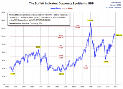
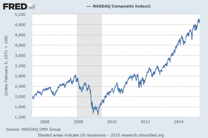
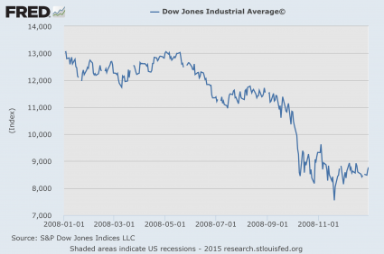
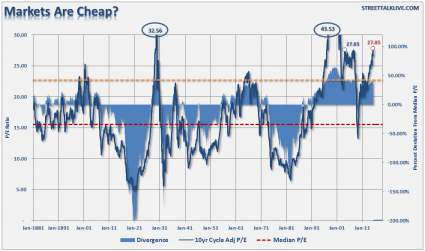
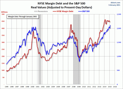
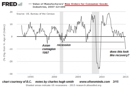
The truth is that we are in the midst of a historic stock market bubble, and we are witnessing all sorts of patterns in the financial markets which also emerged back in 2008 right before the financial crash in the fall of that year.

When some of the most prominent bankers at some of the biggest banks on the entire planet start issuing ominous warnings, that is a clear sign that time is running out.  The period of relative stability that we have been enjoying has been fun, and hopefully it will last just a little while longer.  But at some point it will end, and then the pain will begin.


If Anyone Doubts That We Are In A Stock Market Bubble, Show Them This Article

Bubble In Hands - Public DomainThe higher financial markets rise, the harder they fall.  By any objective measurement, the stock market is currently well into bubble territory.  Anyone should be able to see this – all you have to do is look at the charts.  Sadly, most of us never seem to learn from history.  Most of us want to believe that somehow “things are different this time”.  Well, about the only thing that is different this time is that our economy is in far worse shape than it was just prior to the last major financial crisis.  That means that we are more vulnerable and will almost certainly endure even more damage this time around.  It would be one thing if stocks were soaring because the U.S. economy as a whole was doing extremely well.  But we all know that isn’t true.  Instead, what we have been experiencing is clearly artificial market behavior that has nothing to do with economic reality.  In other words, we are dealing with an irrational financial bubble, and all irrational financial bubbles eventually burst.  And as I wrote about yesterday, the way that stocks have moved so far this year is eerily reminiscent of the way that stocks moved in early 2008.  The warning signs are there – if you are willing to look at them.

The first chart that I want to share with you today comes from Doug Short.  It is a chart that shows that the ratio of corporate equities (stocks) to GDP is the second highest that it has been since 1950.  The only other time it has been higher was just before the dotcom bubble burst…

The Buffett Indicator from Doug Short

Does that look like a bubble to you?

It sure looks like a bubble to me.

In order for the corporate equities to GDP ratio to get back to the mean (average) level, stock prices would have to fall nearly 50 percent.

If that happens, people will be calling it a crash, but in truth it would just be a return to normalcy.

This next chart comes from Phoenix Capital Research.  The CAPE ratio (cyclically adjusted price-to-earnings ratio) is considered to be an extremely accurate measure of the true value of stocks…

As I’ve noted before, the single best predictor of stock market performance is the cyclically adjusted price-to-earnings ratio or CAPE ratio.

Corporate earnings are heavily influenced by the business cycle. Typically the US experiences a boom and bust once every ten years or so. As such, companies will naturally have higher P/E’s at some points and lower P/E’s at other. This is based solely on the business cycle and nothing else.

CAPE adjusts for this by measuring the price of stocks against the average of ten years’ worth of earnings, adjusted for inflation. By doing this, it presents you with a clearer, more objective picture of a company’s ability to produce cash in any economic environment.

Based on a study completed Vanguard, CAPE was the single best metric for measuring future stock returns.

When the CAPE ratio is too high, that means that stocks are overpriced and are not a good value.  And right now the CAPE ratio is the 3rd highest that it has been since 1890.  That only times it has been higher than this were in 1929 (we all remember what happened then) and just before the dotcom bubble burst…

CAPE - Phoenix Capital Research

The funny thing is that stocks have continued to rise even as corporate revenues have begun to fall.

According to Wolf Richter, in the first quarter of 2015 corporate revenues are projected to decline at the fastest pace that we have seen since the depths of the last recession…

Week after week, corporations and analysts have been whittling down their estimates. By now, revenues of the S&P 500 companies are expected to decline 2.8% in Q1 from a year ago – the worst year-over-year decline since Q3 of crisis year 2009.

This next chart I want to share with you shows how the Nasdaq has performed over the past decade.  Looking at this chart alone, you would think that the U.S. economy must have been absolutely roaring since the end of the last recession.  But what is really going on is rampant speculation.  Some of the tech companies that make up the Nasdaq are not making any profits at all and yet they are supposedly worth billions of dollars.  If you cannot see a bubble in this chart, you need to get your vision checked…

NASDAQ Chart

And this kind of irrational euphoria is not just happening in the United States.

For example, Chinese stocks are up nearly 80 percent over the past nine months.

Meanwhile, the overall Chinese economy is growing at the slowest pace that we have seen in about 20 years.

Right now, we are in the calm before the storm.  We are right at the door of the next great financial crisis, and most of the people that work in the industry know this.

And once in a while they let the cat out of the bag.

For example, consider what Hans-Jörg Vetter, the CEO of Landesbank Baden-Württemberg in Germany, had to say during one recent press conference

“Risk is no longer priced in,” he said. And these investors aren’t paid for the risks they’re taking. This applies to all asset classes, he said. The stock and the bond markets, he said, are now both seeing “the mother of all bubbles.”

This can’t go on forever. Or for very long. But he couldn’t see the future either and pin down a date, which is what everyone wants to know so that they can all get out in time. “I cannot tell you when it will rumble,” he said, “but eventually it will rumble again.”

By “again” he meant the sort of thing that had taken the bank down last time, the Financial Crisis. It had been triggered by horrendous risk-taking, where risks hadn’t been priced into all kinds of securities. When those securities – mortgage-backed securities, for example, that were hiding the inherent risks under a triple-A rating – blew up, banks toppled.

What Vetter is telling us is what I have been warning about for a long time.

Another great stock market crash is coming.

It is just a matter of time.

The Stock Market In 2015 Is Starting To Look Remarkably Similar To The Stock Market In 2008

Bubble Mirror - Public DomainAre we watching a replay of the last financial crisis?  Over the past six months, the price of oil has collapsed, the U.S. dollar has soared, and a whole bunch of other patterns that we witnessed just before the stock market crash of 2008 are repeating once again.  But what we have not seen yet is the actual stock market crash.  So will there be one this year?  In this article, I am going to compare the performance of the Dow Jones Industrial Average during the first three months of 2008 to the performance of the Dow Jones Industrial Average during the first three months of 2015.  As you will see, there are some striking similarities.  And without a doubt, we are overdue for a major market downturn.  The S&P 500 has risen for six years in a row, but it has never had seven up years consecutively.  In addition, there has not even been a 10 percent stock market “correction” is almost three and a half years.  So will stocks be able to continue to defy both gravity and the forces of economic reality?  Only time will tell.

Below is a chart that shows how the Dow Jones Industrial Average performed during the first three months of 2008.  It was a time of increased volatility, but the market pretty much went nowhere.  This is typical of what we see in the months leading up to a market crash.  The markets start getting really choppy with large ups and large downs…

Dow First 3 Months Of 2008

This next chart shows how the Dow Jones Industrial Average has performed during the first three months of 2015.  Once again, we are witnessing a time of increased volatility, but the market is not really going anywhere.  In fact, after falling about 200 points on Tuesday (not shown on this chart) it is just barely below where it started the year…

Dow First 3 Months Of 2015

When the market becomes quite restless but it doesn’t really move anywhere, that is a sign that we have reached a turning point.  The following is what a recent CNN article had to say about the rising volatility that we have been witnessing…

The Dow fell nearly 3.7% in January, surged 5.6% in February and is down about 2% this month. The S&P 500 and Nasdaq have gone through similar sentiment swings. The Dow ended the quarter slightly in the red while the S&P 500 and Nasdaq were up a little bit.

Charles Schwab chief investment officer Liz Ann Sonders summed up this volatility the best — with a nod to U2. “Running to Stand Still: Wild Swings Taking Market Nowhere” is the title of her most recent market commentary.

What can investors expect for the rest of 2015? Probably a lot more of the same.

Now let’s look at a chart for the entire year of 2008.  After peaking for the year in early May, the Dow started to slide.  Things started to get really crazy in September, and by the end of the year the U.S. economy was plunged into the greatest crisis since the Great Depression…

Dow Full Year Of 2008

Will the rest of 2015 follow a similar pattern?

A lot of investors are actually betting that this will be the case.

Right now, hundreds of millions of dollars are flowing into VXX – an ETF that makes money when the Chicago Board Options Exchange Volatility Index goes up.  In other words, these investors are betting that we are going to see a lot more stock market volatility in the weeks and months to come.

And as I have said so many times before, stocks tend to rise in calm markets and they tend to fall when the markets become volatile.

So essentially these investors are betting that we are headed for a stock market crash.

The following is more on the massive inflow of money into VXX that we have been seeing from the Crux

Ways to speculate on how noisy the stock market will be have exploded in the last decade with the advent of products tied to the Chicago Board Options Exchange Volatility Index. Strategies include relatively simple hedges against equity losses, such as owning a security that aims to mimic the VIX.

VXX, one of the most popular ways to bet on bigger market swings, has absorbed $715 million in seven consecutive weeks of inflows, its longest streak of inflows since one ending in July 2012. The infusion of fresh cash has continued this week, swelling its market value to $1.5 billion, the highest since September 2013.

At the same time, short-sellers in VXX — people effectively betting the bull market will persist — have dropped out. Short interest has slid 35 percent since October, falling to the lowest in more than seven months last week, data compiled by Markit Ltd. show.

And many of the exact same people that warned us about the financial crisis of 2008 in advance are warning that another crisis is rapidly approaching.  For example, check out the following quote from Ann Pettifor that recently appeared in an article in the Guardian

As Janet Yellen’s Federal Reserve prepares to raise interest rates, boosting the value of the dollar, while the plunging price of crude puts intense pressure on the finances of oil-exporting countries, there are growing fears of a new debt crisis in the making.

Ann Pettifor of Prime Economics, who foreshadowed the credit crunch in her 2003 book The Coming First World Debt Crisis, says: “We’re going to have another financial crisis. Brazil’s already in great trouble with the strength of the dollar; I dread to think what’s happening in South Africa; then there’s Malaysia. We’re back to where we were, and that for me is really frightening.”

Pettifor is right on two counts – another major financial crisis is approaching, and it is going to be global in scope.

Before I end this article, there are two more items that I would like to share with you.

Firstly, it is being reported that the IPO market has really cooled off in 2015.  When the number of companies going public starts to decline, that is a clear sign that a stock market bubble is on borrowed time.  The following comes from Business Insider

The number of US companies going public has really dropped off lately.

“After a record year in 2014, the IPO market slowed dramatically in the first quarter of 2015,” Renaissance Capital analysts said.

The first quarter of 2015, which ended Tuesday, was the slowest quarter for IPOs since the first quarter of 2013. While stock prices have been near all-time highs, market volatility has been escalating, turning companies off from trying to unload shares onto the public markets.

Secondly, the San Francisco housing market has been a pretty reliable indicator of previous economic booms and busts.  The San Francisco housing market started to cool off before the dotcom bubble burst, it started to cool off before the stock market crash of 2008, and now it is cooling off once again.  The following chart comes from Zero Hedge

San Francisco - Zero Hedge

The warning signs are there.

But as with so many other things in life, most people are going to end up believing precisely what they want to believe.

So what do you believe about what the rest of the year will bring?  Please feel free to share your thoughts by posting a comment below…

The Price Of Ground Beef Has DOUBLED Since The Last Financial Crisis

Burger And Fries - Photo by Ewan MunroSince the depths of the last recession, the price of ground beef in the United States has doubled.  Has your paycheck doubled since then?  Even though the Federal Reserve insists that we are in a “low inflation” environment, the government’s own numbers show that the price of ground beef has been on an unprecedented run over the past six years.  In early 2009, the average price of a pound of ground beef was hovering near 2 dollars.  In February, it hit a brand new all-time record high of $4.238 per pound.  Even just 12 months ago, the price of ground beef was sitting at $3.555 per pound.  So we are talking about a huge increase.  And this hits American families where they really live.  Each year, the average American consumes approximately 270 pounds of meat.  The only nation in the world that eats more meat than we do is Luxembourg.  If the paychecks of American workers were going up fast enough to deal with this increase, it wouldn’t be that big of a deal.  But of course that is not happening.  In an article just last week, I showed that real median household income is a couple thousand dollars lower now than it was during the depths of the last recession.  The middle class is being squeezed, and we are rapidly getting to the point where burgers are going to be considered a “luxury” item.

The following chart was posted by the Economic Policy Journal on Wednesday, and it incorporates the latest data from the Bureau of Labor Statistics.  When I first saw it, I was rather stunned.  I knew that the price of ground beef had become rather outrageous in my local grocery stores, but I had no idea just how much damage had been done over the past six years…

Beef Price - Economic Policy Journal

The biggest reason why the price of ground beef has been going up is the fact that the U.S. cattle herd has been shrinking.  It shrunk seven years in a row, and on January 1st, 2014 it was the smallest that it had been since 1951.

The good news is that the decline appears to have stopped, at least for the moment.  According to the Wall Street Journal, the size of the U.S. cattle herd actually increased by 1 percent last year…

The U.S. cattle herd expanded in 2014 for the first time in eight years, offering hope to consumers that beef prices could start to subside after soaring to a series of records.

The nation’s cattle supply increased 1% in the year through Jan. 1 to 89.8 million head, according to data released Friday by the U.S. Agriculture Department, reversing a steady decline fueled by prolonged drought in the southern U.S. Great Plains and industry consolidation that encouraged many ranchers to thin herds.

But an increase of 1 percent is just barely going to keep up with the official population growth rate.  If you factor in illegal immigration, we are still losing ground.

And if we have another major drought in cattle country this summer, the cattle herd is going to start shrinking again.

In addition, the price of food overall has been steadily rising for years.  Here is a chart that I shared the other day

Presentation Food Inflation

It boggles the mind that the Federal Reserve can claim that we are in a “low inflation” environment.  Anyone that goes grocery shopping feels the pain of these rising prices every time that they go to the store.

In the list that I put together yesterday, I included the following statistic…

Almost half of all Americans (47 percent) do not put a single penny out of their paychecks into savings.

One of the primary reasons why so many Americans are not saving any money is because many families simply cannot save any money.  Their paychecks are stagnant while the cost of living just keeps going up and up.

There simply are not enough “good jobs” out there anymore.  Our economy continues to bleed middle class jobs and the competition for the jobs that remain is quite intense.

Do you know what the two most common occupations in America today are?

According to the Bureau of Labor Statistics, they are “retail sales clerk” and “cashier”.

And of course neither of those “occupations” pays even close to what is required to support a middle class family.

On average, a retail sales clerk makes $24,020 a year, and a cashier makes $20,670 a year.

Because the quality of our jobs has declined so much, there are millions of American families today in which both the mother and the father are working multiple jobs in a desperate attempt to make ends meet each month.

But don’t worry, the Federal Reserve says that we are nearly at “full employment“, and Barack Obama says that everything is going to be just fine.

Actually, the truth is that things are about to get a lot worse.  At this point, we are even getting pessimistic numbers out of the Federal Reserve.  Just this week we learned that the Fed is now projecting that economic growth for the first quarter of 2015 will be barely above zero

From almost 2.5% GDP growth expectations in February, The Atlanta Fed’s GDPNow model has now collapsed its estimates of Q1 GDP growth to just 0.2%plunging from +1.4% just 2 weeks ago. The reality of plunging capex and no decoupling is starting to rear its ugly head in the hard data and as the sun warms things up, weather will start to lose its ability to sway sentiment.

We are at a turning point.  The bubble of false stability that we have been living in is rapidly coming to an end, and when people start to realize that another great economic crisis is coming there is going to be a lot of panic.

And as far as food prices go, they are just going to keep taking a bigger chunk out of all of our wallets.

As high as prices are already, the truth is that your food dollars are never going to go farther than they do right now.

So let us hope for the best, but let us also get prepared for the worst.

10 Charts Which Show We Are Much Worse Off Than Just Before The Last Economic Crisis

10 Charts Economic CrisisIf you believe that ignorance is bliss, you might not want to read this article.  I am going to dispel the notion that there has been any sort of “economic recovery”, and I am going to show that we are much worse off than we were just prior to the last economic crisis.  If you go back to 2007, people were feeling really good about things.  Houses were being flipped like crazy, the stock market was booming and unemployment was relatively low.  But then the financial crisis of 2008 struck, and for a while it felt like the world was coming to an end.  Of course it didn’t come to an end – it was just the first wave of our problems.  The waves that come next are going to be the ones that really wipe us out.  Unfortunately, because we have experienced a few years of relative stability, many Americans have become convinced that Barack Obama, Janet Yellen and the rest of the folks in Washington D.C. have fixed whatever problems caused the last crisis.  Even though all of the numbers are screaming otherwise, there are millions upon millions of people out there that truly believe that everything is going to be okay somehow.  We never seem to learn from the past, and when this next economic downturn strikes it is going to do an astonishing amount of damage because we are already in a significantly weakened state from the last one.

For each of the charts that I am about to share with you, I want you to focus on the last shaded gray bar on each chart which represents the last recession.  As you will see, our economic problems are significantly worse than they were just before the financial crisis of 2008.  That means that we are far less equipped to handle a major economic crisis than we were the last time.

#1 The National Debt

Just prior to the last recession, the U.S. national debt was a bit above 9 trillion dollars.  Since that time, it has nearly doubled.  So does that make us better off or worse off?  The answer, of course, is obvious.  And even though Barack Obama promises that “deficits are under control”, more than a trillion dollars was added to the national debt in fiscal year 2014.  What we are doing to future generations by burdening them with so much debt is beyond criminal.  And so what does Barack Obama want to do now?  He wants to ramp up government spending and increase the debt even faster.  This is something that I covered in my previous article entitled “Barack Obama Says That What America Really Needs Is Lots More Debt“.

Presentation National Debt

#2 Total Debt

Over the past 40 years, the total amount of debt in the United States has skyrocketed to astronomical heights.  We have become a “buy now, pay later” society with devastating consequences.  Back in 1975, our total debt level was sitting at about 2.5 trillion dollars.  Just prior to the last recession, it was sitting at about 50 trillion dollars, and today we are rapidly closing in on 60 trillion dollars.

Presentation Credit Market Instruments

#3 The Velocity Of Money

When an economy is healthy, money tends to change hands and circulate through the system quite rapidly.  So it makes sense that the velocity of money fell dramatically during the last recession.  But why has it kept going down since then?

Presentation Velocity Of M2

#4 The Homeownership Rate

Were you aware that the rate of homeownership in the United States has fallen to a 20 year low?  Traditionally, owning a home has been a sign that you belong to the middle class.  And the last recession was really rough on the middle class, so it makes sense that the rate of homeownership declined during that time frame.  But why has it continued to steadily decline ever since?

Presentation Homeownership Rate

#5 The Employment Rate

Barack Obama loves to tell us how the unemployment rate is “going down”.  But as I will explain later in this article, this decline is primarily based on accounting tricks.  Posted below is a chart of the civilian employment-population ratio.  Just prior to the last recession, approximately 63 percent of the working age population of the United States was employed.  During the recession, this ratio fell to below 59 percent and it stayed there for several years.  Just recently it has peeked back above 59 percent, but we are still very, very far from where we used to be, and now the next economic downturn is rapidly approaching.

Presentation Employment Population Ratio

#6 The Labor Force Participation Rate

So how can Obama get away with saying that the unemployment rate has gone down dramatically?  Well, each month the government takes thousands upon thousands of long-term unemployed workers and decides that they have been unemployed for so long that they no longer qualify as “part of the labor force”.  As a result, the “labor force participation rate” has fallen substantially since the end of the last recession…

Presentation Labor Force Participation Rate

#7 The Inactivity Rate For Men In Their Prime Working Years

If things are “getting better”, then why are so many men in their prime working years doing nothing at all?  Just prior to the last recession, the inactivity rate for men in their prime working years was about 9 percent.  Today it is just about 12 percent.

Presentation Inactivity Rate

#8 Real Median Household Income

Not only is a smaller percentage of Americans employed today than compared to just prior to the last recession, the quality of our jobs has gone down as well.  This is one of the factors which has resulted in a stunning decline of real median household income.

Presentation Real Median Household Income

I have shared these next numbers before, but they bear repeating.  In America today, most Americans do not make enough to support a middle class lifestyle on a single salary.  The following figures come directly from the Social Security Administration

-39 percent of American workers make less than $20,000 a year.

-52 percent of American workers make less than $30,000 a year.

-63 percent of American workers make less than $40,000 a year.

-72 percent of American workers make less than $50,000 a year.

We all know people that are working part-time jobs because that is all that they can find in this economy.  As the quality of our jobs continues to deteriorate, the numbers above are going to become even more dismal.

#9 Inflation

Even as our incomes have stagnated, the cost of living just continues to rise steadily.  For example, the cost of food and beverages has gone up nearly 50 percent just since the year 2000.

Presentation Food Inflation

#10 Government Dependence

As the middle class shrinks and the number of Americans that cannot independently take care of themselves soars, dependence on the government is reaching unprecedented heights.  For instance, the federal government is now spending about twice as much on food stamps as it was just prior to the last recession.  How in the world can anyone dare to call this an “economic recovery”?

Presentation Government Spending On Food Stamps

So you tell me – are things “getting better” or are they getting worse?

To me, it is crystal clear that we are in much worse condition than we were just prior to the last economic crisis.

And now things are setting up in textbook fashion for the next great economic crisis.  Unfortunately, most Americans are totally clueless about what is going on and the vast majority are completely and totally unprepared for what is coming.

Or could it be possible that I am wrong?  Whether you agree or disagree with me, please feel free to add to the discussion by posting a comment below…

Why I Wouldn’t Want To Be A Police Officer In America Today

Police - Public DomainCan you imagine going to work each day knowing that there are lots of people out there that would love to see you dead?  Despite what a lot of Americans may think, it takes real courage to be a police officer in this country today.  Every time you put on that uniform and walk out the front door, it might be the very last time that you ever see your spouse and family.  Yes, there is a whole lot of needless police brutality in the United States in 2015, and I am going to address that later in this article.  But most police officers are just regular people that are trying to do their jobs and serve their communities.  And on Wednesday, we got a reminder of just how dangerous those jobs can be.  At around midnight on Wednesday, two Ferguson police officers were ambushed.  A 32-year-old officer named Webster Groves was shot just beneath his right eye, and another 41-year-old officer was hit in the shoulder.  Sadly, this is probably only just the beginning.  Racial tensions continue to escalate, and we are on the verge of a great financial crisis which will cause economic conditions in our cities to deteriorate rapidly.  By the end of this decade, I fully expect civil unrest, rioting, looting and mindless violence to become commonplace in large cities all across America.  In such an environment, it will be extremely dangerous to be a police officer.

The good news for the two police officers that got shot in Ferguson is that it looks like they are going to be okay.

But the same cannot be said for many other police officers that have been ambushed over the past year.

According to CNN, the number of police officers that were shot to death increased by more than 50 percent in 2014…

The number of law enforcement officers shot to death in the line of duty is up by more than 50% this year, and the leading method of those shootings was ambush-style attack.

That’s according to the nonprofit Washington-based National Law Enforcement Officers Memorial Fund, which released its findings Tuesday.

And like I said, this is probably only just the beginning.

Sadly, a whole lot more police are going to die before this is all over.

You can try to blame this latest incident in Ferguson on a “deranged individual” if you want, but I think that the reactions that we saw on social media to these police shootings say a whole lot about where we are as a country.

In the immediate aftermath of the shootings, a lot of people were actually celebrating.  The following is a sampling of comments  from Twitter

-#ChiefJackson steps down and two pigs get shot? Best day #Ferguson has had in years

-im glad 2 pigs wounded in #Ferguson lol

-#Ferguson kill the pigs

-serves those two pigs right, i hope organized public militancy continues #ferguson

-#Ferguson pigs shouldnt grab ppl; thugs deserved it. Wish it was #DarrenWilson. Sound familiar? #MichaelBrown #VonderittMyers #AntonioMartin

-Racist cops shot not gonna cry 4 pigs #Ferguson

-I heard two pigs in #Ferguson got shot? We’re they left on the ground bleeding out and dead like Mike Brown?

-hopefully they’ll be off the street for a long time. two less pigs out harassing & kidnapping people. #Ferguson

Could you imagine trying to be a police officer in Ferguson in this kind of environment?

And it isn’t as if we didn’t see this coming.  Just consider an excerpt from an article that I authored a while back entitled “It’s WAR On The Streets Of America“…

The mainstream media and many national leaders on the left end of the spectrum have been stirring up strife and division for months on end.  So now a toxic environment has been created which is inevitably going to lead to even more violence.  At some recent “protest marches”, we have heard demonstrators enthusiastically chant extremely threatening slogans such as this: “What do we want? Dead cops!”  And when news broke that Ismaaiyl Brinsley had brutally murdered two NYPD police officers, lots of very twisted people on Twitter were actually celebrating.

The sick thing is that there are a lot of people out there that actually want to turn this into a full-blown war.  Some want a race war, some want a “war on cops”, and others just seem to want a general excuse for crime, looting and mayhem.

Unfortunately, if I am right, this is just a small preview of what we can expect in the years ahead.  Just like we have witnessed in Ferguson, I anticipate that we will eventually see a number of our larger cities burn.

And it never had to be this way.

Why can’t we all just love, respect and honor one another?

Yes, police brutality in the United States is wildly out of control.  In many areas of the nation, police officers are actually trained to bark orders, act like thugs and physically abuse people at the drop of a hat.  Our entire culture of policing needs to change.

I think that John W. Whitehead put it very aptly in one of his recent commentaries

For those of us who have managed to survive 2014 with our lives intact and our freedoms hanging by a thread, it has been a year of crackdowns, clampdowns, shutdowns, showdowns, shootdowns, standdowns, knockdowns, putdowns, breakdowns, lockdowns, takedowns, slowdowns, meltdowns, and never-ending letdowns.

We’ve been held up, stripped down, faked out, photographed, frisked, fracked, hacked, tracked, cracked, intercepted, accessed, spied on, zapped, mapped, searched, shot at, tasered, tortured, tackled, trussed up, tricked, lied to, labeled, libeled, leered at, shoved aside, saddled with debt not of our own making, sold a bill of goods about national security, tuned out by those representing us, tossed aside, and taken to the cleaners.

As I point out in my book A Government of Wolves: The Emerging American Police State, we’ve had our freedoms turned inside out, our democratic structure flipped upside down, and our house of cards left in a shambles.

We’ve had our children burned by flashbang grenades, our dogs shot, and our old folks hospitalized after accidental” encounters with marauding SWAT teams. We’ve been told that as citizens we have no rights within 100 miles of our own border, now considered “Constitution-free zones.” We’ve had our faces filed in government databases, our biometrics crosschecked against criminal databanks, and our consumerist tendencies catalogued for future marketing overtures.

Now a large segment of our population either detests the police or is extremely fearful of ever dealing with them.

Is that a recipe for a healthy society?

Police brutality has become a permanent part of our culture, and that has got to change.  If it doesn’t, protests against the police are going to get worse and worse.

But what most protesters don’t seem to understand is that we actually need the police.

Without the police, our society would descend into utter chaos very rapidly.  Thanks to unchecked illegal immigration, there are approximately 1.4 million gang members roaming our cities now.  And the moral decay that we see all around us is getting worse with each passing year.  We are a nation that is absolutely teeming with addicts, sickos, perverts and psychopaths.  I don’t even want to imagine what our society would look like without police.

Like I said, most police officers are just average people that are trying to do their jobs and serve their communities.

Unfortunately for them, their jobs are becoming a lot more difficult and a lot more dangerous.

So what do you think?  Please feel free to share your thoughts by posting a comment below…

The Last, Great Run For The U.S. Dollar, The Death Of The Euro And 74 Trillion In Currency Derivatives At Risk

Dollars Euros - Public DomainAre we on the verge of an unprecedented global currency crisis?  On Tuesday, the euro briefly fell below $1.07 for the first time in almost a dozen years.  And the U.S. dollar continues to surge against almost every other major global currency.  The U.S. dollar index has now risen an astounding 23 percent in just the last eight months.  That is the fastest pace that the U.S. dollar has risen since 1981.  You might be tempted to think that a stronger U.S. dollar is good news, but it isn’t.  A strong U.S. dollar hurts U.S. exports, thus harming our economy.  In addition, a weak U.S. dollar has fueled tremendous expansion in emerging markets around the planet over the past decade or so.  When the dollar becomes a lot stronger, it becomes much more difficult for those countries to borrow more money and repay old debts.  In other words, the emerging market “boom” is about to become a bust.  Not only that, it is important to keep in mind that global financial institutions bet a tremendous amount of money on currency movements.  According to the Bank for International Settlements, 74 trillion dollars in derivatives are tied to the value of the U.S. dollar, the value of the euro and the value of other global currencies.  When currency rates start flying around all over the place, you can rest assured that someone out there is losing an enormous amount of money.  If this derivatives bubble ends up imploding, there won’t be enough money in the entire world to bail everyone out.

Do you remember what happened the last time the U.S. dollar went on a great run like this?

As you can see from the chart below, it was in mid-2008, and what followed was the worst financial crisis since the Great Depression…

Dollar Index 2015

A rapidly rising U.S. dollar is extremely deflationary for the overall global economy.

This is a huge red flag, and yet hardly anyone is talking about it.

Meanwhile, the euro continues to spiral into oblivion…

Euro U.S. Dollar

How many times have I said it?  The euro is heading to all-time lows.  It is going to go to parity with the U.S. dollar, and then it is eventually going to go below parity.

This is going to cause massive headaches in the financial world.

The Europeans are attempting to cure their economic problems by creating tremendous amounts of new money.  It is the European version of quantitative easing, but it is having some very nasty side effects.

The markets are starting to realize that if the value of the U.S. dollar continues to surge, it is ultimately going to be very bad for stocks.  In fact, the strength of the U.S. dollar is being cited as the primary reason for the Dow’s 332 point decline on Tuesday

The Dow Jones industrial average fell more than 300 points to below the index’s 50-day moving average, wiping out gains for the year. The S&P 500 also closed in the red for the year and breached its 50-day moving average, which is an indicator of the market trend. Only the Nasdaq held onto gains of 2.61 percent for the year.

There’s “concern that energy and the strength in the dollar will somehow be negative for the equities,” said Art Hogan, chief market strategist at Wunderlich Securities. He noted that the speed of the dollar’s surge was the greatest market driver, amid mixed economic data and concerns about the Federal Reserve raising interest rates.

And as I noted above, when the U.S. dollar rises the things that we export to other nations become more expensive and that hurts our businesses.

This is so basic that even the White House understands it

Despite reassurance from The Fed that a strengthening dollar is positive for US jobs, The White House has now issued a statement that a “strengthening USD is a headwind for US growth.”

But even more important, a surging U.S. dollar makes it more difficult for emerging markets all over the world to borrow new money and to repay old debts.  This is especially true for nations that heavily rely on exporting commodities

It becomes especially ugly for emerging market economies that produce commodities. Many emerging market countries rely on their natural resources for growth and haven’t yet developed more advanced industries. As the products of their principal industries decline in value, foreign investors remove available credit while their currency is declining against the U.S. dollar. They don’t just find it difficult to pay their debt – it is impossible.

It has been estimated that emerging markets have borrowed more than 3 trillion dollars since the last financial crisis.

But now the process that created the emerging markets “boom” is starting to go into reverse.

The global economy is fueled by cheap dollars.  So if the U.S. dollar continues to rise, that is not going to be good news for anyone.

And of course the biggest potential threat of all is the 74 trillion dollar currency derivatives bubble which could end up bursting at any time.

The sophisticated computer algorithms that financial institutions use to trade currency derivatives are ultimately based on human assumptions.  When currencies move very little and the waters are calm in global financial markets, those algorithms tend to work really, really well.

But when the unexpected happens, some of the largest financial firms in the world can implode seemingly overnight.

Just remember what happened to Lehman Brothers back in 2008.  Unexpected events can cripple financial giants in just a matter of hours.

Today, there are five U.S. banks that each have more than 40 trillion dollars of total exposure to derivatives of all types.  Those five banks are JPMorgan Chase, Bank of America, Goldman Sachs, Citibank and Morgan Stanley.

By transforming Wall Street into a gigantic casino, those banks have been able to make enormous amounts of money.

But they are constantly performing a high wire act.  One of these days, their reckless gambling is going to come back to haunt them, and the entire global financial system is going to be severely harmed as a result.

As I have said so many times before, derivatives are going to be at the heart of the next great global financial crisis.

And thanks to the wild movement of global currencies in recent months, there are now more than 74 trillion dollars in currency derivatives at risk.

Anyone that cannot see trouble on the horizon at this point is being willingly blind.

7 Signs That A Stock Market Peak Is Happening Right Now

Stock Market Crash - Public DomainIs this the end of the last great run for the U.S. stock market?  Are we witnessing classic “peaking behavior” that is similar to what occurred just before other major stock market crashes?  Throughout 2014 and for the early stages of 2015, stocks have been on quite a tear.  Even though the overall U.S. economy continues to be deeply troubled, we have seen the Dow, the S&P 500 and the Nasdaq set record after record.  But no bull market lasts forever – particularly one that has no relation to economic reality whatsoever.  This false bubble of financial prosperity has been enjoyable, and even I wish that it could last much longer.  But there comes a time when we all must face reality, and the cold, hard facts are telling us that this party is about to end.  The following are 7 signs that a stock market peak is happening right now…

#1 Just before a stock market crash, price/earnings ratios tend to spike, and that is precisely what we are witnessing.  The following commentary and chart come from Lance Roberts

The chart below shows Dr. Robert Shiller’s cyclically adjusted P/E ratio. The problem is that current valuations only appear cheap when compared to the peak in 2000. In order to put valuations into perspective, I have capped P/E’s at 30x trailing earnings. The dashed orange line measures 23x earnings which has been the level where secular bull markets have previously ended. I have noted the peak valuations in periods that have exceeded that 30x earnings.

markets are cheap - StreetTalkLive

At 27.85x current earning the markets are currently at valuation levels where previous bull markets have ended rather than continued. Furthermore, the markets have exceeded the pre-financial crisis peak of 27.65x earnings. If earnings continue to deteriorate, market valuations could rise rapidly even if prices remain stagnant.

#2 The average bull market lasts for approximately 3.8 years. The current bull market has already lasted for six years.

#3 The median total gain during a bull market is 101.5 percent.  For this bull market, it has been 213 percent.

#4 Usually before a stock market crash we see a divergence between the relative strength index and the stock market itself.  This happened prior to the bursting of the dotcom bubble, it happened prior to the crash of 2008, and it is happening again right now

The first technical warning sign that we should heed is marked by a significant divergence between the relative strength index (RSI) and the market itself. This is noted by a declining pattern of lower highs in the RSI as stocks continue to make higher highs, a sign that the market is “topping out”. In the late ‘90s this divergence persisted for many years as the tech bubble reached epic valuation levels. In 2007 this divergence lasted over a much shorter period (6 months) before the market finally peaked and succumbed to massive selling. With last month’s strong rally to new records, we now have a confirmed divergence between the long-term relative strength index and the market’s price action.

#5 In the past, peaks in margin debt have been very closely associated with stock market peaks.  The following chart comes from Doug Short, and I included it in a previous article

Margin Debt

#6 As I have discussed previously, we usually witness a spike in 10 year Treasury yields just about the time that the stock market is peaking right before a crash.

Well, according to Business Insider, we just saw the largest 5 week rate rally in two decades…

Lots of guys and gals went home this past weekend thinking about the implications of the recent rise in the 10-year Treasury bond’s yield.

Chris Kimble notes it was the biggest 5-week rate rally in twenty years!

#7 A lot of momentum indicators seem to be telling us that we are rapidly approaching a turning point for stocks.  For example, James Stack, the editor of InvesTech Research, says that the Coppock Guide is warning us of “an impending bear market on the not-too-distant horizon”

A momentum indicator dubbed the Coppock Guide, which serves as “a barometer of the market’s emotional state,” has also peaked, Stack says. The indicator, which, “tracks the ebb and flow of equity markets from one psychological extreme to another,” is also flashing a warning flag.

The Coppock Guide’s chart pattern is flashing a “double top,”  which suggests that “psychological excesses are present” and that “secondary momentum has peaked” in this bull market, according to Stack.

“All of this is just another reason for concern about an impending bear market on the not-too-distant horizon,” Stack writes.

So if we are to see a stock market crash soon, when will it happen?

Well, the truth is that nobody knows for certain.

It could happen this week, or it could be six months from now.

In fact, a whole lot of people are starting to point to the second half of 2015 as a danger zone.  For example, just consider the words of David Morgan

“Momentum is one indicator and the money supply. Also, when I made my forecast, there is a big seasonality, and part of it is strict analytical detail and part of it is being in this market for 40 years. I got a pretty good idea of what is going on out there and the feedback I get. . . . I’m in Europe, I’m in Asia, I’m in South America, I’m in Mexico, I’m in Canada; and so, I get a global feel, if you will, for what people are really thinking and really dealing with. It’s like a barometer reading, and I feel there are more and more tensions all the time and less and less solutions. It’s a fundamental take on how fed up people are on a global basis. Based on that, it seems to me as I said in the January issue of the Morgan Report, September is going to be the point where people have had it.”

Time will tell if Morgan was right.

But without a doubt, lots of economic warning signs are starting to pop up.

One that is particularly troubling is the decline in new orders for consumer goods.  This is something that Charles Hugh-Smith pointed out in one of his recent articles…

The financial news is astonishingly rosy: record trade surpluses in China, positive surprises in Europe, the best run of new jobs added to the U.S. economy since the go-go 1990s, and the gift that keeps on giving to consumers everywhere, low oil prices.

So if everything is so fantastic, why are new orders cratering? New orders are a snapshot of future demand, as opposed to current retail sales or orders that have been delivered.

Posted below is a chart that he included with his recent article.  As you can see, the only time things have been worse in recent decades was during the depths of the last financial crisis…

Charles Hugh-Smith New Orders

To me, it very much appears that time is running out for this bubble of false prosperity that we have been living in.

But what do you think?  Please feel free to contribute to the discussion by posting a comment below…